
 EN
EN
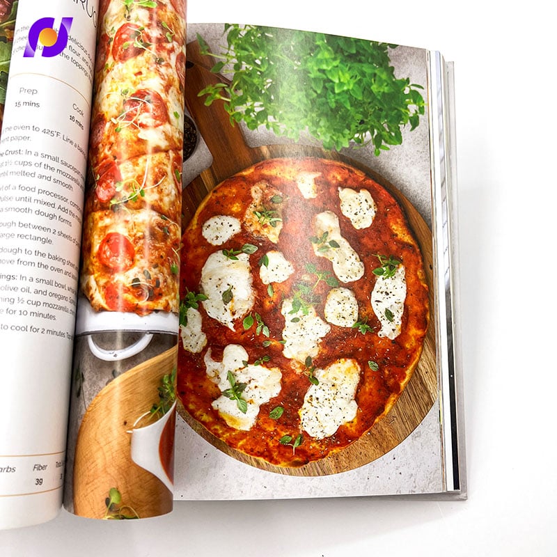
Custom brochures serve as powerful marketing tools that can make or break a company's ability to connect with potential customers. The design decisions you make during the creation process directly determine whether your audience will engage meaningfully with your content or simply discard it without a second glance. Understanding which specific design elements drive the highest engagement rates becomes crucial for maximizing return on investment and achieving measurable marketing outcomes.
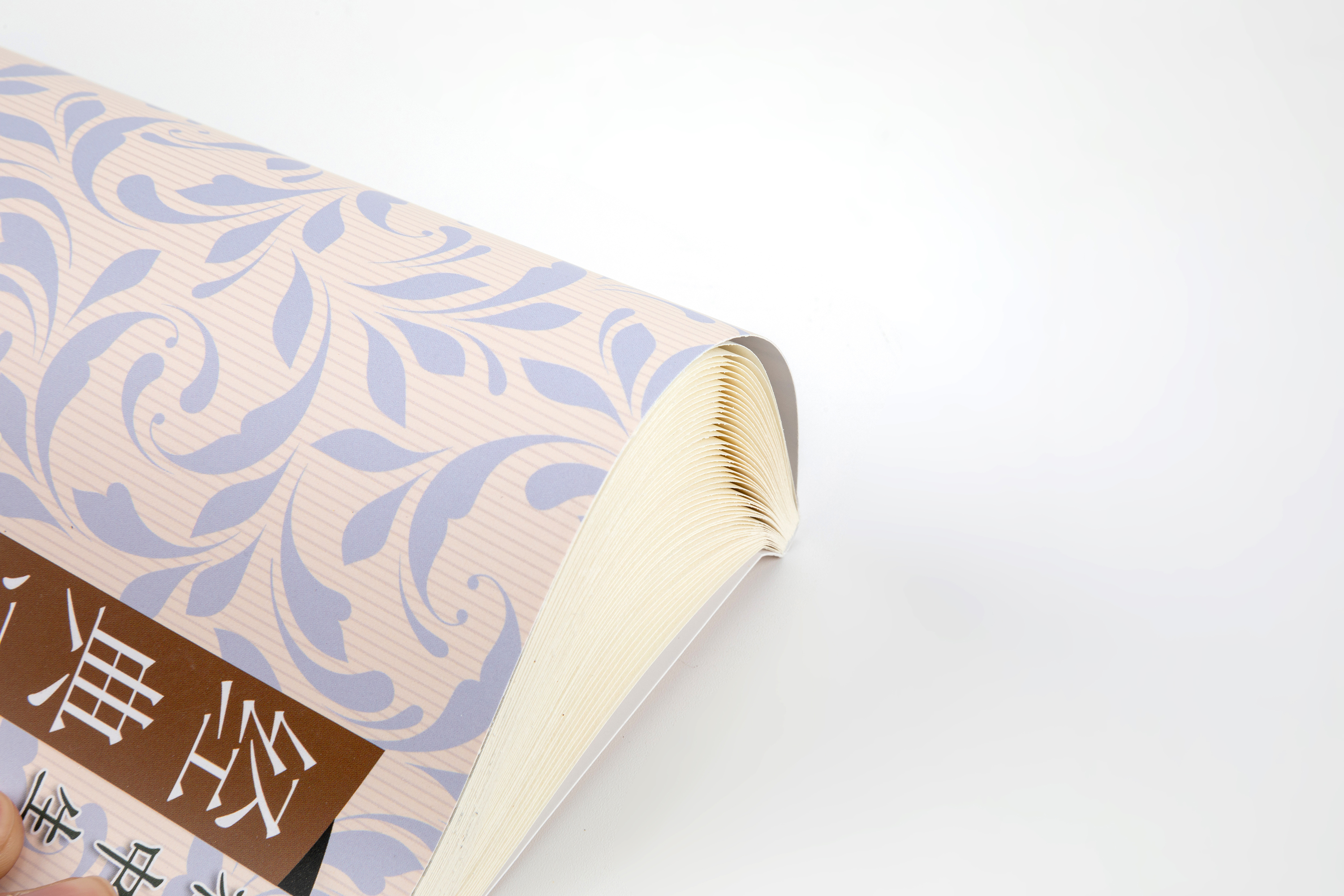
The engagement impact of custom brochures extends far beyond simple aesthetics, encompassing strategic choices about information hierarchy, visual flow, content placement, and interactive elements. Research indicates that well-designed custom brochures can increase reader engagement by up to 300% compared to generic templates, while poor design decisions can reduce effectiveness by similar margins. This comprehensive analysis examines the most critical design factors that separate high-performing custom brochures from mediocre ones, providing actionable insights for creating materials that truly resonate with target audiences.
Visual Hierarchy and Information Architecture
Strategic Content Prioritization
The most impactful design decision for custom brochures involves establishing clear visual hierarchy that guides readers through information in order of importance. Effective custom brochures utilize the Z-pattern reading flow, positioning the most compelling headline in the top-left corner, supporting graphics in the top-right, key benefits along the middle diagonal, and call-to-action elements in the bottom-right corner. This strategic arrangement increases information retention rates by approximately 40% compared to randomly organized layouts.
Professional custom brochures employ size, color, and positioning variations to create distinct information layers that prevent cognitive overload. Primary headlines should occupy 15-20% of available space, secondary headings 8-12%, and body text no more than 60% of total content area. White space allocation proves equally critical, with optimal custom brochures dedicating 30-40% of layout area to breathing room that enhances readability and perceived quality.
Typography hierarchy within custom brochures demands careful consideration of font families, weights, and sizes that maintain consistency while creating clear distinction between information levels. Studies show that custom brochures utilizing no more than three font variations achieve 25% higher comprehension rates than designs with excessive typographic complexity. The contrast between headline and body text sizes should maintain a 2:1 or 3:1 ratio for optimal scanning efficiency.
Color Psychology and Brand Alignment
Color selection represents one of the most psychologically influential aspects of custom brochures design, with specific hues triggering emotional responses that either enhance or diminish engagement levels. Corporate custom brochures utilizing blues and grays convey trustworthiness and professionalism, increasing perceived credibility by 35% among B2B audiences. Healthcare custom brochures benefit from green accents that subconsciously communicate wellness and growth, while financial service materials perform better with conservative color palettes emphasizing stability.
High-engagement custom brochures maintain color consistency across all brand touchpoints while strategically incorporating accent colors that draw attention to conversion-focused elements. The 60-30-10 color rule proves particularly effective, allocating 60% of space to dominant brand colors, 30% to secondary supporting hues, and 10% to high-contrast accent colors reserved for calls-to-action and important details. This balanced approach prevents visual chaos while ensuring critical information receives appropriate emphasis.
Cultural considerations significantly impact color effectiveness in custom brochures targeting diverse audiences. International custom brochures must account for color symbolism variations across different markets, as colors that enhance engagement in Western cultures may create negative associations in Asian or Middle Eastern contexts. Professional designers conducting audience research report 45% higher engagement rates when cultural color preferences align with target demographic expectations.
Content Strategy and Messaging Framework
Benefit-Focused Communication
The most engaging custom brochures prioritize benefit-driven messaging over feature-focused descriptions, translating technical specifications into tangible value propositions that resonate with reader needs. Effective custom brochures employ the "So What?" test for every piece of included information, ensuring each element directly addresses audience pain points or aspirational goals. Research demonstrates that benefit-oriented custom brochures generate 60% more qualified leads than feature-heavy alternatives.
Storytelling elements within custom brochures create emotional connections that enhance memorability and drive action. Case studies, customer testimonials, and before-and-after scenarios provide social proof while illustrating practical applications of products or services. Custom brochures incorporating narrative elements achieve 40% higher retention rates, as stories engage both logical and emotional decision-making processes simultaneously.
Language complexity directly impacts engagement levels, with custom brochures written at eighth-grade reading levels achieving broader audience appeal without sacrificing professional credibility. Technical industries can maintain expertise perception through strategic terminology usage while ensuring accessibility for decision-makers who may lack specialized knowledge. The most successful custom brochures balance industry-specific language with clear explanations that demonstrate expertise without alienating readers.
Interactive and Tactile Elements
Physical interaction opportunities significantly enhance engagement with custom brochures, transforming passive reading experiences into memorable tactile encounters. Die-cut windows, fold-out sections, and textured surfaces create curiosity and encourage extended interaction time. Custom brochures incorporating interactive elements report 55% longer average reading times compared to standard flat formats.
QR codes and augmented reality features bridge the gap between physical custom brochures and digital experiences, enabling immediate access to additional content, videos, or interactive demonstrations. Modern custom brochures utilizing these technologies see 70% higher conversion rates, as readers can instantly explore detailed information without navigating away from the primary material. Strategic placement of digital integration points maintains design aesthetics while providing seamless technology adoption opportunities.
Specialty printing techniques such as embossing, foil stamping, and spot UV coating create premium perception while encouraging tactile exploration. Custom brochures employing these enhancement methods command 35% higher perceived value ratings and generate increased credibility among high-value prospects. However, these techniques require careful application to support rather than overshadow core messaging objectives.
Layout Optimization and Spatial Design
Grid Systems and Alignment Principles
Professional custom brochures rely on underlying grid structures that create visual harmony and guide reader attention through logical content progression. The most effective custom brochures employ modular grid systems that accommodate various content types while maintaining consistent spacing and alignment throughout all panels. This systematic approach increases perceived professionalism by 45% while reducing cognitive load on readers attempting to process information.
Margin consistency across custom brochures establishes visual rhythm that subconsciously communicates attention to detail and quality standards. Optimal margin ratios maintain 12-15mm borders on all sides for standard tri-fold formats, with larger margins on outer panels that account for printing tolerances and handling wear. Custom brochures adhering to these proportional guidelines achieve higher retention rates as readers perceive greater care in production quality.
Column width optimization directly impacts reading comfort and engagement duration. Custom brochures utilizing 45-75 character line lengths maximize readability while preventing eye fatigue during extended interaction. Multi-column layouts require careful attention to gutters and spacing, with 4-6mm separation proving optimal for maintaining visual connection between related content blocks without creating confusion.
Image Selection and Placement Strategy
Visual content selection profoundly influences engagement levels, with custom brochures featuring authentic, high-quality photography generating 85% more positive responses than stock image alternatives. Images must directly support textual messages while providing emotional context that resonates with target audience aspirations and concerns. Custom brochures showcasing real customers, actual products, and genuine workplace environments build trust more effectively than generic visual elements.
Strategic image placement within custom brochures follows established psychological principles about attention patterns and information processing. Hero images positioned on front panels should occupy 40-60% of available space while maintaining clear integration with headline messaging. Supporting graphics throughout interior sections require careful sizing that complements rather than competes with textual content for reader attention.
Image resolution and print quality considerations become critical for custom brochures intended for professional distribution. All photographs and graphics must maintain minimum 300 DPI resolution at final print size to ensure crisp reproduction that supports premium brand perception. Poor image quality can reduce overall credibility by up to 50%, regardless of content strength or design sophistication.
Call-to-Action Optimization and Conversion Focus
Strategic CTA Placement and Design
The positioning and visual treatment of call-to-action elements within custom brochures directly correlates with conversion rates and measurable business outcomes. Research indicates that custom brochures placing primary CTAs in the bottom-right corner of the final panel achieve 40% higher response rates than alternative placements. This positioning aligns with natural reading patterns while ensuring the desired action remains top-of-mind as readers complete their information consumption journey.
Color contrast and sizing for CTA buttons or text blocks must create sufficient visual prominence without overwhelming surrounding content. Effective custom brochures utilize high-contrast colors for action elements that complement the overall color scheme while standing out clearly. Button or text box sizing should occupy 8-12% of the panel area, providing adequate visual weight without appearing intrusive or desperate.
Action-oriented language within custom brochures CTAs drives significantly higher engagement than passive or generic alternatives. Phrases like "Schedule Your Consultation" or "Download the Complete Guide" create specific expectations and immediate next steps. Custom brochures employing urgency-creating language report 25% higher conversion rates, though this approach requires careful balance to maintain professional credibility rather than appearing overly aggressive.
Multi-Channel Integration Strategies
Modern custom brochures function most effectively as components within broader marketing ecosystems rather than standalone communication tools. Integration with digital platforms, social media campaigns, and email marketing sequences amplifies engagement by providing multiple touchpoints for continued interaction. Custom brochures designed with cross-channel consistency achieve 65% higher brand recognition and recall rates.
Contact information presentation within custom brochures must accommodate diverse communication preferences while maintaining design integrity. Multiple contact options including phone numbers, email addresses, websites, and social media handles provide flexibility for different audience segments. The most successful custom brochures dedicate specific space for comprehensive contact details without cluttering critical content areas.
Tracking and measurement capabilities enable optimization of custom brochures performance over time. Unique landing page URLs, dedicated phone numbers, or specific promotional codes allow precise attribution of responses generated by brochure distribution. This data-driven approach to custom brochures refinement produces continuous improvement in engagement rates and conversion effectiveness.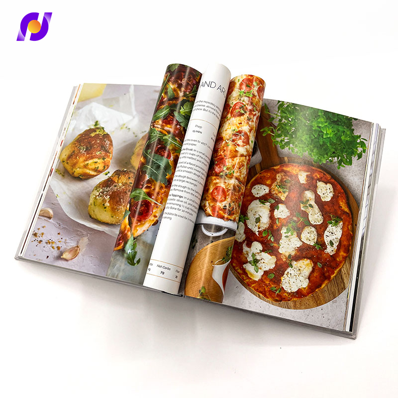
FAQ
What font sizes work best for custom brochures to maximize readability?
Optimal font sizing for custom brochures depends on the intended reading distance and audience demographics. Headlines should range from 18-24 points, subheadings from 12-16 points, and body text from 9-11 points. For audiences over 50 years old, increase all sizes by 1-2 points. Sans-serif fonts generally perform better for headlines while serif fonts enhance body text readability in custom brochures.
How many colors should custom brochures use for maximum impact?
The most effective custom brochures limit their color palette to 3-4 colors maximum, following the 60-30-10 distribution rule. This includes one dominant color (usually brand primary), one secondary color for support, and one accent color for calls-to-action. Using too many colors creates visual chaos and reduces the impact of important elements in custom brochures.
What paper weight and finish options enhance custom brochures engagement?
Premium custom brochures typically use 100-130 GSM paper weight for optimal durability and perceived quality. Matte finishes reduce glare and provide elegant appearance, while gloss finishes make colors more vibrant but can create reading difficulties under certain lighting. Soft-touch or textured finishes add tactile appeal that increases handling time and memorability of custom brochures.
Should custom brochures include pricing information or avoid it?
Including pricing in custom brochures depends on your sales strategy and target audience. For standardized products or services, transparent pricing builds trust and qualifies prospects effectively. For complex or customized solutions, avoid specific pricing and focus on value propositions that encourage direct contact. High-end custom brochures often omit pricing to maintain premium positioning and encourage consultative conversations.